Three by Three: Guest Artists in Focus
QUESTION 2. Many of your works juxtapose subtle and bold color shifts to amplify or soften optical motion. How do you approach color selection when aiming for a specific perceptual effect?
ANSWER 2. I tend to rely on certain colour combinations that I know react well together, for example green and violet, blue and brown, turquoise and magenta. I mix the colours in advance, doing colour tests to ensure even steps between each tint. I number the containers, then write the number on the painting surface where that particular tint is to go, so painting by numbers, but … my painting, my numbers! Mixing colours like this means there is often enough paint for several paintings – the airtight pots I keep the paint in keeps the paint wet for as long as I need it, and this means that I often have several colour combinations I can use at any one time.
In some paintings, colours all go dark to light in the same direction, in other paintings one colour will go dark to light next to another colour going light to dark.
Reversal of normal colour tropes can also create an effect – for instance, paler colours and smaller shapes look further away than larger, darker shapes. So making smaller shapes a darker colour than larger shapes in the same painting can create a feeling of tension on the surface.
I also paint many monochrome paintings, and with these often the colour doesn’t matter – it’s the gradation, so 031 of 2024 (the orange painting) could have been done in any colour and the effect would be the same.
Pete Greening
Painter
MEDIUM: acrylic, mostly on hardboard but occasionally on canvas board
BIO: Male, aged 71, living close to London, UK. I’ve been painting for my own enjoyment, in a geometric abstract style, since I discovered the work of Bridget Riley in 1970 when I was 16. I was in an art education course at the time and wanted to paint like that in class, but the tutor was saying ‘No, paint this vase of flowers’ or ‘No, draw this feather’ so I left and got a job while painting what I wanted, when I wanted, how I wanted. Thus, I am mainly self-taught.
I produced about 10 paintings a year, having occasional exhibitions, until I retired from my job in 2014, and now paint full time and have had many exhibitions since then. I rarely title my paintings, intending the viewer to provide their own interpretation of them.
A recent development that would make creating my style of art easy is Generative AI. Although AI has its uses, I think Generative AI is bad - bad for the planet, bad for artists and bad for the human brain. Also, why should I see / read / watch something that someone couldn’t be bothered to create for themselves?
LINK: SaatchiArt
QUESTION 3. Your pieces have appeared on limited-edition vinyl LP covers from Drone Records. How does translating your optical patterns into a music context influence the way you conceive scale, density, or rhythm within a composition?
ANSWER 3. I listen to a lot of music while painting, but have what many people consider a strange taste in music – I like electronic drone pieces, long tracks of a slowly evolving sounds - and had for many years considered my paintings, with their slowly changing shapes and colours, to be analogous to this sort of music. So I was quite thrilled when the owner of German record label Drone Records approached me and asked if he could use my paintings on the covers of a series of limited edition vinyl LPs. Terms were agreed and there have been 9 releases so far in the series – a tenth one is in the planning stages. I have also allowed my work to be used on releases by other labels / artists – a search for my name on Discogs.com will reveal all.
QUESTION 1. Your acrylic-painted hardboard surfaces create a taut, almost vibrating presence. What makes hardboard an ideal substrate for your geometric abstractions compared to canvas or more conventional supports?
ANSWER 1. When I started painting, I bought cheap art supplies – the place where I got my paints also sold pre-prepared hardboard much more cheaply than canvas, so I used that. After a few years I did try canvas, but found the textured surface off-putting, so soon returned to hardboard where I believe the flatness of the surface suits the style of my paintings more. During one of the covid lockdowns of the early 2020s, I ran out of hardboard and the woodyard where I normally bought it was closed so I ordered some canvas covered boards from an online art store. I regretted it, and returned to hardboard as soon as possible.
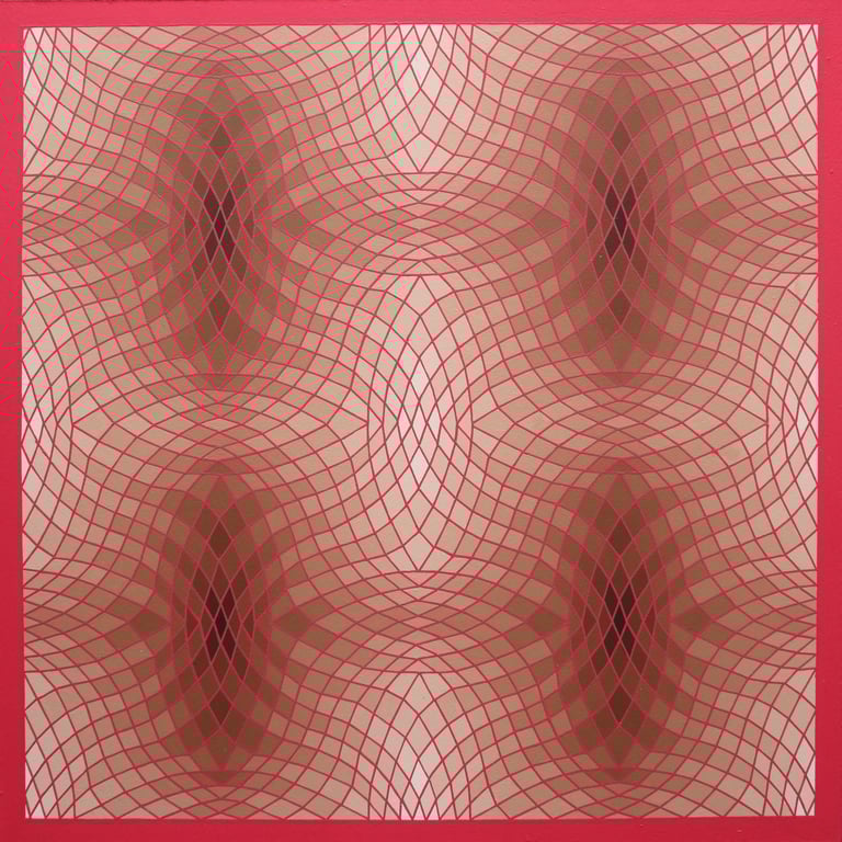
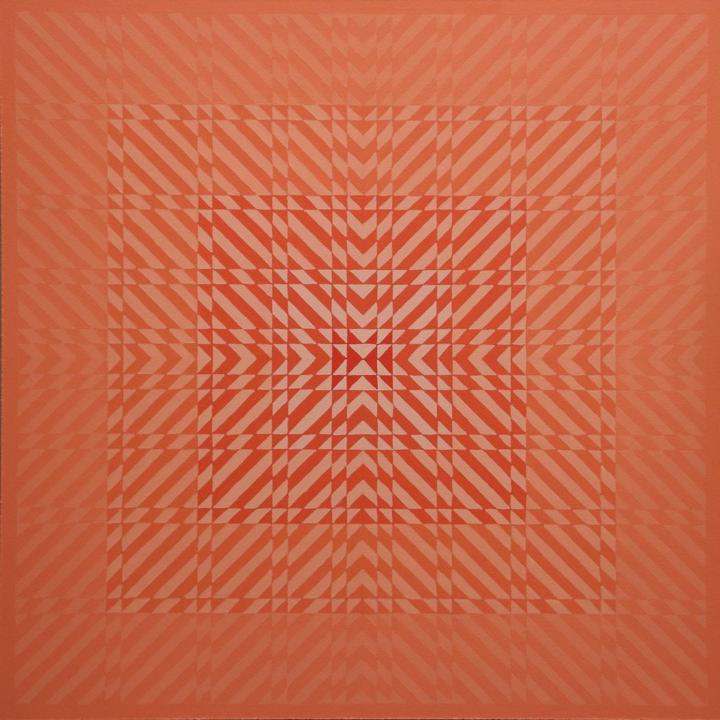

031 of 2024
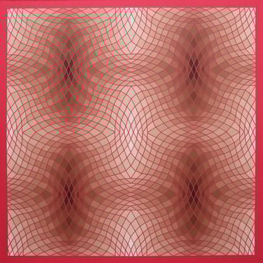
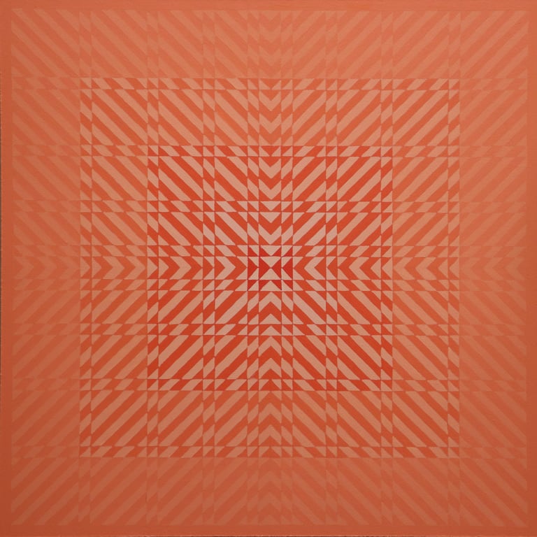
051 of 2025
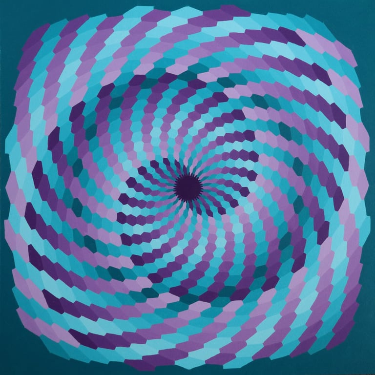
016 of 2025
All copyright and reproduction rights are reserved by Pete Greening.
Artwork may not be reproduced in any form without the artist's express written permission.
CLICK IMAGE FOR FULL VIEW
CLICK IMAGE FOR FULL VIEW
CLICK IMAGE FOR FULL VIEW
All images and written materials on this website are protected intellectual property. All copyright and reproduction rights are reserved by KC Magrath.
Artwork may not be reproduced in any form without the artist's express written permission.
Any use of this content to train, develop, or operate generative artificial intelligence or machine-learning systems-whether commercial or non-commercial—is expressly prohibited without prior written permission.
Photos by KC Magrath are reduced in resolution and watermarked. Purchased images will be at the resolution listed in the store and without watermarks.
Purchased digital downloads are intended solely for personal use at the prices listed.
For commercial use or inquiries about designating a photo as a Limited Edition, please email.
Licensing Agreement.
Privacy Policy
Cookies Policy
Giveaway1 & Terms